The SeeItEarly brand
SeeItEarly is free advance movie screenings near you. These are our logos, colors, and usage rules. Take what you need to link to us or cover us in editorial.
The SeeItEarly name and two-circle mark are our brand. Use these assets to link to us or in editorial coverage. Don’t use them commercially, alter them, or use them in any way that implies affiliation or endorsement without our written consent.
One word: SeeItEarly
The single rule that matters most. If you get one thing right, get this.
Download the logo
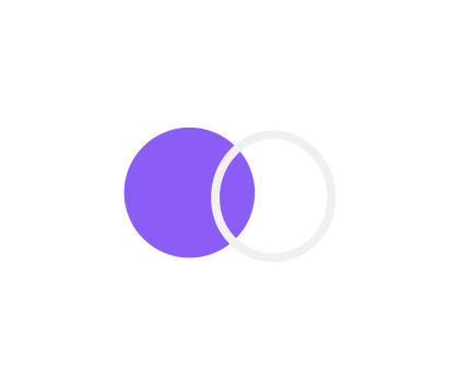
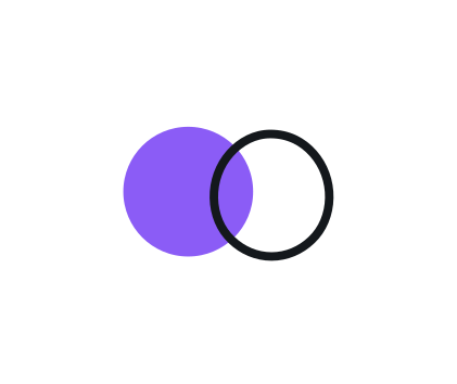
The mark is two circles: a solid violet circle and an open off-white one. It locks up with the wordmark, set in Sora bold with the second word in violet. Grab any variant below.


Give it room
Protect the mark with clear space and don’t shrink it past legibility.
Keep clear space on all sides equal to x, the diameter of the open circle. Nothing else (no text, no graphics, no edge) sits inside this zone.
Below these sizes the open circle and the camel-case break up. For favicons and app icons use the mark in its rounded-square container instead of shrinking the lockup.
The palette
Violet leads. Everything else is neutral ground or a functional UI accent that stays secondary.
Violet is the single identity color. The off-white (#F0F0F0, not pure white) is the mark outline and primary text.
The accents the product renders over the neutral ground: green FREE, the red urgency tag (Tonight, 2d left), pink for celebrity appearances, and the cyan “Early Screening” signal on event detail pages. Featured placements and raffles reuse the brand violet rather than a separate color. Event cards no longer carry NEW or EARLY badges.
Sora & Inter
Sora carries headings and the wordmark. Inter does everything else. Both load from Google Fonts.
SeeItEarly aggregates free advance screening passes from dozens of sources so you can see movies before they hit theaters. Apr 28 · AMC Century City · Los Angeles, CA
Keep it intact
Use the supplied files as-is. The examples below show what breaks the brand.
The disc arrives early
The one way the mark may move: a reveal that ends on the exact lockup. Everything else about the logo stays still.
The disc starts one clear-space unit (x, the open circle’s height) to the left and travels on one axis into the lockup. The dashed circle is a diagram, never part of the logo.
- One move. The violet disc slides in from the left and settles into the lockup in 0.5 s with a calm ease-out. The open circle is already in place and never moves.
- The wordmark fades in after the disc has landed (0.4 to 0.65 s). From 0.65 s the frame is the exact lockup, and it holds: 1.5 s or more in a video, about 0.9 s total on a screen.
- Use the supplied files. Don’t re-create or re-time the motion.
- No scale, rotation, blur, glow, bounce or overshoot. No sound.
- Never freeze, hold or loop a frame in which the two circles sit apart, and never use an in-between frame as a logo.
- Below 20 px mark height, or for viewers who prefer reduced motion, show the static lockup. The files do this on their own: no slide, a 200 ms fade.
How we sound
A quick reference. The full voice guide lives in the codebase.
Terse, direct, factual. Lead with early, qualify with free. Second person, title-case CTAs, numbers over adjectives. No hype, no false urgency, no cutesy interjections.
Everything in one download
All eight logo lockups, the mark, and the four animated reveals as SVG, light and dark, plus the brand color values. Need a single PNG, an MP4 bumper, or a print format? Grab it from the grids above, or email us.
Press or partnership question?
Logo files, interview requests, or anything brand-related. We reply within two business days.
Press and sponsors: see the media kit.